
Cohort analysis is a powerful tool for product teams looking to reduce churn and boost user retention. And, with the right Product Analytics tool in place, everyone on the team can conduct cohort analysis quickly and turn insights into action and results.
Here, we cover:
- What cohort analysis is
- Why it’s important for businesses and product managers (PMs)
- How to conduct cohort analysis
- How to turn your analysis into results
What is Cohort Analysis?
Cohort analysis is a type of Product Analytics that groups users of your product into groups (called cohorts) based on characteristics, behaviors, or experiences those users share—usually within the same timeframe.
By analyzing cohorts, product teams can decipher how those behaviors and characteristics compare over time.
For example: a remote collaboration app may want to look at users who signed up during the first week of the COVID-19 lockdown. By using cohort analysis, they can compare that cohort to users who signed up before lockdown and identify how when users sign up impacts things like retention vs. churn, revenue, lifetime value, and more.
What Are the Two Types of Cohort Analysis?
There are two broad categories for cohort analysis—because you can group cohorts based on when they were acquired or based on a particular behavior they exhibit (like a repeat purchase or upgrade, for example).
- Acquisition cohorts group users based on when they were acquired or completed signup. Teams often track acquisition cohorts based on daily, weekly, or monthly signups.
- Behavioral cohorts divide users into groups based on specific behaviors they exhibit within the app, during a particular time period.
Retention analysis is sometimes considered a third category, but it really falls under behavioral cohort analysis—because it’s defined by users who perform a certain behavior (like completing a repeating purchase or actively using a particular feature or upgrading).
What’s the Difference Between Cohort Analysis and Churn Analysis?
Churn analysis is one type of analysis we often see confused for cohort analysis—but they’re two different things.
Cohort analysis is focused on users and the commonalities among them that correlate with churn, retention, or revenue—it’s the who behind churn. There’s an equal focus on customers who stay and customers who churn.
Churn analysis, on the other hand, is specifically focused on the users who leave, and it usually involves digging into the why behind churn. The scope is broader and may include a variety of data sources like negative reviews, customer support tickets, and customer surveys.
Cohort analysis may be a part of your churn analysis, but it isn’t the whole thing.
Why Does Cohort Analysis Matter to a Business?
Cohort analysis is an invaluable tool for all companies.
For one, analyzing users by cohort helps reduce churn and boost retention by identifying why customers churn and how product managers can proactively solve for churn. Then, once you develop a hypothesis on how to improve retention, cohort analysis makes it easy and straightforward to test your solution and measure how (and if) it reduces churn.
For example: if you launch a new onboarding flow designed to boost activation, you can track ongoing retention and churn for the cohort of users who signed up (and completed the flow) that day. That way, you can see the impact of the new flow in near real-time and make additional changes when needed.
How to Perform Cohort Analysis
Let’s talk about how you can perform a cohort analysis, including templates and software to make the process a lot easier.
Basic Steps to Conduct Cohort Analysis
The basic steps to conduct cohort analysis are pretty straightforward. You’re basically following the scientific method—develop a hypothesis, gather data, and then test. Here are the steps you should follow, regardless of where and how you choose to conduct your analysis.
- Determine your hypothesis or research question: What are you hoping to learn from this analysis and how will you use that information?
- Define the metrics that will help answer your question: If you’re looking to find out why some users churn, you may want to consider churn and 7-day retention, for example.
- Define specific cohorts that are relevant: Who are the users you’re interested in looking at? When did they sign up or complete the target behavior you’re interested in?
- Analyze the report: With the information from steps 2 and 3, you can run your report—either by hand or using software that offers cohort analysis features (like Indicative).
- Test and review results: From the report, you should be able to answer your original question and confirm or refute your hypothesis. The next step is to implement any changes and monitor how results change over time.
Cohort Analysis Template: Analyzing by Hand
You don’t need any specialized tools to perform cohort analysis. Everything can be calculated and laid out by hand—usually in a spreadsheet.
If you opt to conduct your analysis by hand, a template can be a big help. One of our favorite cohort analysis templates is from ProfitWell, and it’s designed to help organize a revenue-based cohort analysis.
Here’s what it looks like:
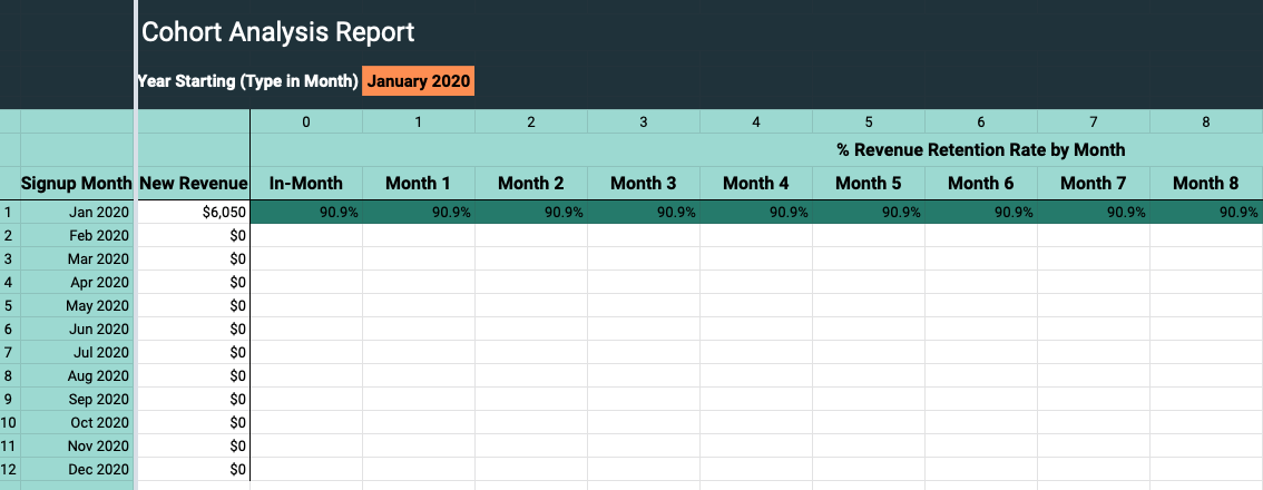
Just make yourself a copy of the template to fill in with your own numbers. You’ll need to input new transactions in the Transactions tab with information on:
- User ID
- Transaction type
- Change date
- Customer start date
- Change in revenue
- Previous subscription amount
- Current subscription amount
From there, all the other reports will calculate automatically, including the Cohort Analysis report. Then, you can view net revenue retention by signup date-based cohorts.
Do You Need Cohort Analysis Software?
If you aren’t into pulling all the data by hand, you can use analytics software to make the cohort analysis process a lot faster, more accurate, and more flexible. When it comes to cohort analysis software, most teams look at three kinds of tool:
- Google Analytics
- Business Intelligence (BI) tools
- Product Analytics
Google Analytics vs. Indicative
You can do a version of cohort analysis in Google Analytics, using the Cohort Analysis report under the Audience section of the menu. You can define the size of your cohort, the date range you want to see, and the metric you want to analyze (e.g. user retention).
But Google’s Cohort Analysis report comes with several limitations:
- You can only define cohorts based on acquisition date (in Google Analytics, acquisition is defined as the first time someone visits your website)
- You can’t fully rely on the retention numbers in this cohort report because of the way Google Analytics tracks users (via cookies)
- Google Analytics isn’t built for product teams, so while there are some product metrics and analyses you can do there, it’s complex and there’s a steep learning curve to get there.
To put it plainly, Google Analytics was built for marketers to track web analytics, not for product teams to optimize churn and retention.
Tableau vs. Indicative
Another option some teams use for cohort analysis is BI tools—Tableau being among the most popular thanks to its data visualization features. Conducting a cohort analysis in Tableau is definitely more reliable than using web analytics software, but it still leaves a few gaps.
Tableau and other BI tools use SQL code to run queries. So the number one drawback to using these tools for cohort analysis is that whoever runs the analysis needs to be experienced with SQL—or slow down the process by running requests through technical resources.
SQL also isn’t built for the complex digital lives of today’s customers. As you add elements to your SQL queries, things get slower and less accurate, and it’s time-consuming to run exploratory and follow-up analyses.
Where Does Product Analytics Come Into Play?
Product Analytics tools are the best option for running cohort analysis. With a Product Analytics tool like Indicative, everyone on the team can:
- Access, interact with, and query data—regardless of technical background
- Conduct exploratory analysis, asking and answering questions in a matter of minutes
- Work with the metrics that matter for product teams
- Connect directly with your data warehouse to view accurate, real-time data
Put simply, Indicative is built for product teams and our Cohort Analysis tool is, too. Plus, cohort analysis is included as part of our free plan, so you can try it out without spending a dollar.
Cohort Analysis Example: How to Do Cohort Analysis in Indicative
Let’s walk through an example of how to conduct cohort analysis using Indicative. We’ll use sample data from PetBox—a fictitious subscription box company for pet owners.
Note: You can walk through this step-by-step tutorial for yourself by exploring our public demo.
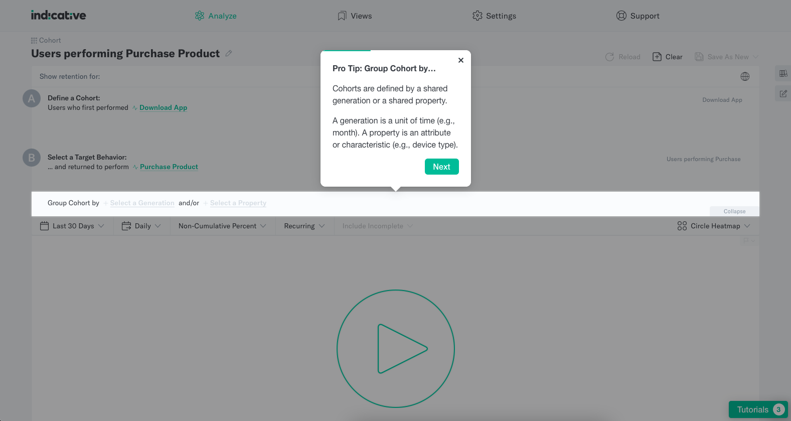
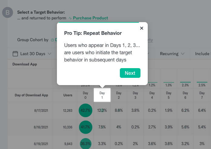
Step 1: Select an event to define your cohort
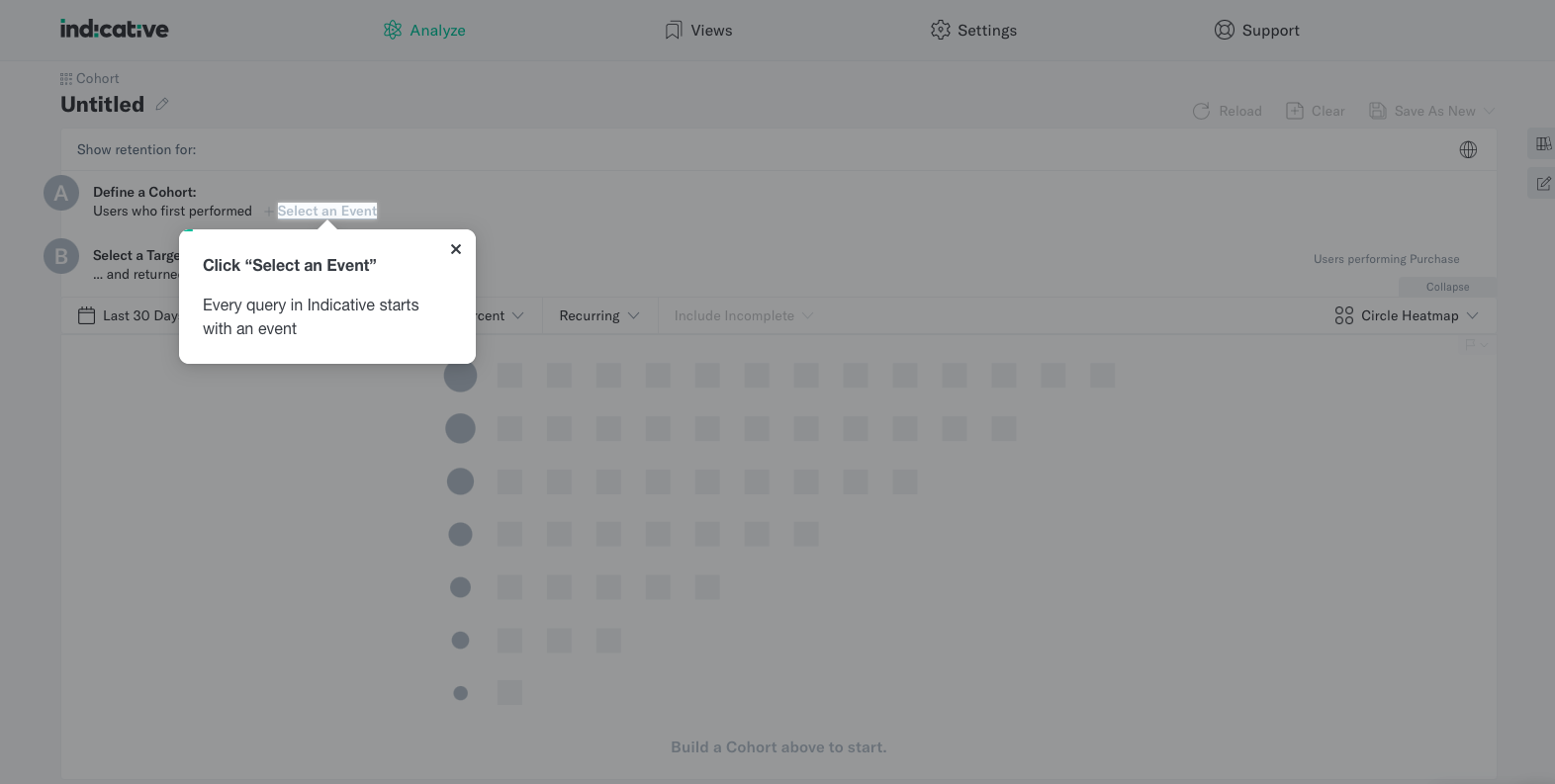
In this case, we’ll look at a cohort of users who downloaded the PetBox app.
Step 2: Select a target behavior
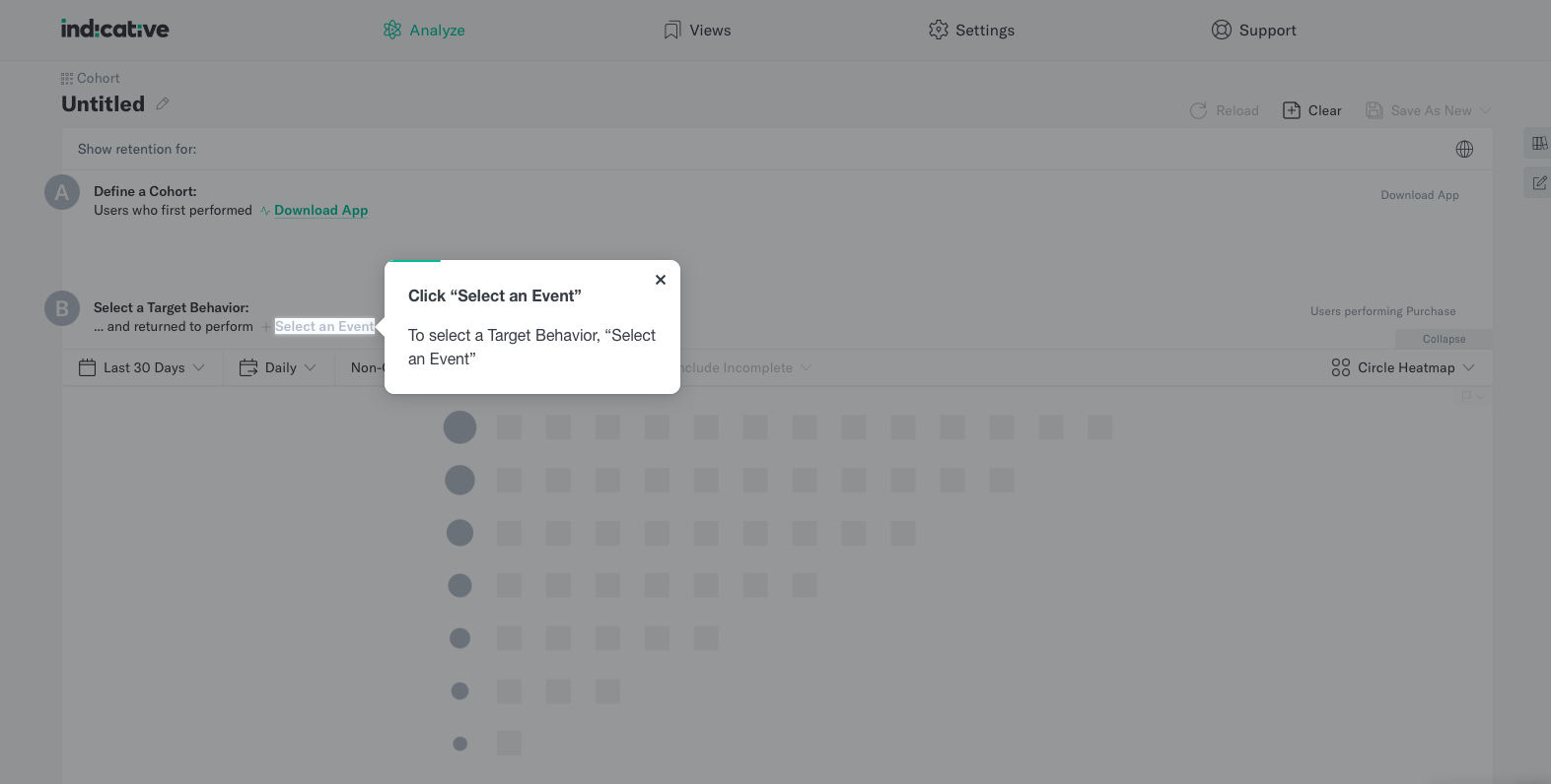
Next, we want to see how many of those users made a purchase over the next 30 days, so we’ll set the Target Behavior to “Purchase Product.” You can also look at app opens over time, repeat purchases, subscriptions, and more.
Step 3: Group your cohort by time, attribute, or characteristic
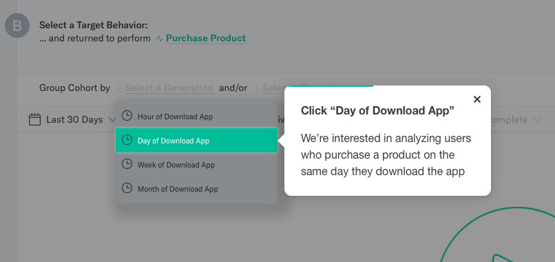
To see how when users download the app impacts purchasing behavior, we’ll group our cohort based on the date they downloaded the PetBox app.
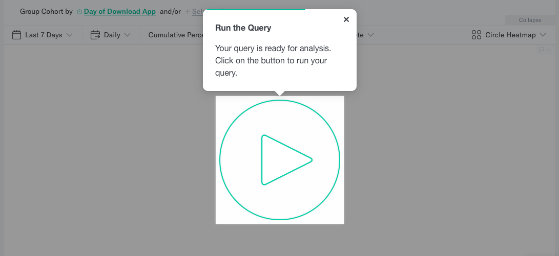
Step 4: Run the query
Step 5: Use cohorts in other tools
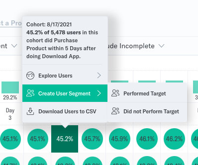
Once your report loads, you can dig into the users within each box and analyze further.
Create a user segment based on this analysis to further explore the users who did or did not complete the target behavior on any given day.
How to Read the Report
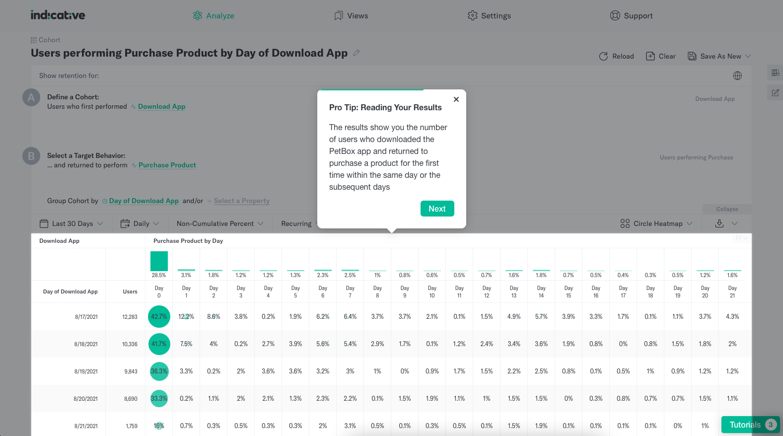
Once you run your cohort analysis, the report will look something like this:
There’s a lot to dig into in this report, so let’s break down the different aspects of it.
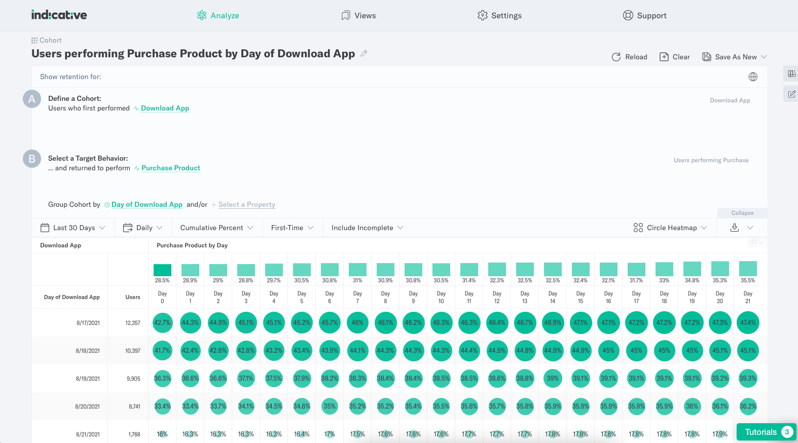
- The chart: In Indicative, the cohort analysis chart shows your target behavior over time—in other words, the percentage of your defined cohort who returned to complete the target behavior over the next period of days. For example, we can see in the screenshot above that the cohort of users who signed up on August 17th and 18th had the highest retention, still over 45% on Day 21.
- Generations and time periods: Cohorts are often grouped into time-based groups that reflect when they signed up, downloaded the app, or completed a particular event or behavior.
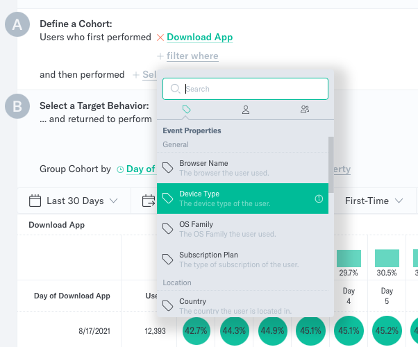
- Filters: You can focus your analysis even more along the way by adding filters for user segments, user properties, or event properties.
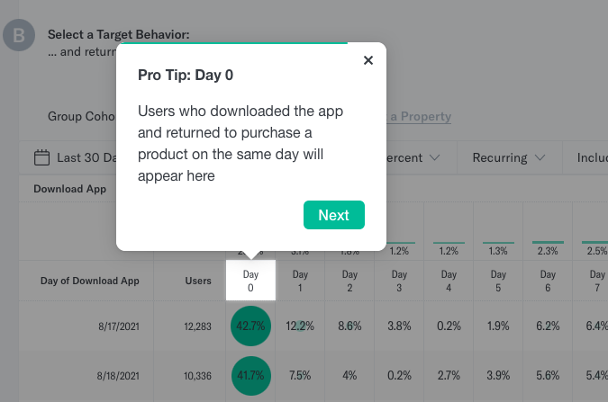
- Columns: Each column represents the number of days after a user performs the first behavior. In our case, the first 30 days following an app download. Day 0, for example, represents the same day a user downloads the app.
- Rows: Each row is a cohort group. In this case, we’re looking at daily cohorts, but you can group cohorts by week or month or by any other attribute you need. For example, you can see the first row in the screenshot below represents users who downloaded the app on August 17, 2021.
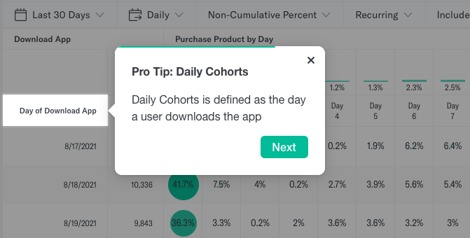
- Cells: Each cell in the main area of the chart shows the percentage of that cohort group who returned to complete the target behavior on each day. In the screenshot below, we can see that 35.9% of users who downloaded the app on September 9th, 2021 made a purchase on the same day, while only 5.5% came back to make a purchase the following day.
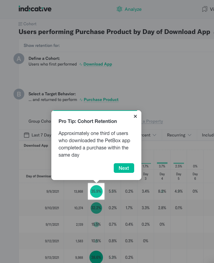
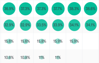
- The circle heatmap: The heatmap effect helps you quickly visualize the cohort groups and days with the highest percentage of target behavior completions. The higher the percentage, the darker the heatmap and bigger the circle.
How to Use Cohort Analysis
There are several different ways product teams can use cohort analysis, but here are the most common scenarios.
- When you need to reduce churn and boost retention
- When you need to protect monthly or annual recurring revenue (MRR and ARR)
- When you need to optimize customer lifetime value (LTV)
Reduce Early Churn
For many companies, the majority of churn happens in the first few days or weeks after a new user signs up. Reducing churn rates in these early stages is one of the most effective ways to improve retention overall—and it often comes down to two things:
- Eliminating friction
- Encouraging and speeding up adoption
Both of those things start with understanding when drop-off happens. That’s where cohort analysis comes into play. By analyzing drop-off among acquisition cohorts, you can pinpoint when users drop-off, in the first 7 or 30 days, for example.
Once you can identify where a large percentage of drop-offs happen, you can dig deeper to find out why. Consider:
- What’s happening in your product at that time?
- What isn’t happening?
- What are users trying to accomplish at this point?
From there, you can develop a hypothesis around why churn is happening there, then test a solution and perform a follow-up acquisition cohort analysis to see if your fix works.
Optimize Revenue Churn
Cohort analysis can help in reducing revenue churn, too, helping you protect recurring revenue over time. Revenue mapping via cohort analysis can help determine how different behavioral cohorts of users impact the bottom line.
When you analyze cohorts based on revenue, you can explore how revenue churn varies based on user attributes and time-based cohorts. For example: you can analyze revenue churn across different subscription or plan types, acquisition periods, devices, marketing channels and sources, and more.
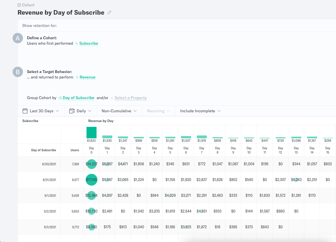
To configure revenue mapping in our Cohort Analysis tool, select “Revenue” as the Target Behavior.
Increase Customer Lifetime Value
You can use cohort analysis to help drive up average lifetime value by finding the behavioral characteristics that correlate with long-term customer retention and repeat purchases. With that knowledge, you can:
- Prioritize features that yield high retention and low churn
- Tailor your onboarding flow to funnel users toward those behaviors
- Create additional nudges to encourage retention-driving behaviors
To explore the behaviors that drive retention, you’ll analyze cohorts that perform a particular recurring behavior—usually a repeat purchase, upgrade, or other indicator of retention. Then, you can compare retention across different user behavioral cohorts and user attributes.
You can explore, for example, whether saving a credit card on file leads to higher retention and lifetime value. Here’s how:
- Define your cohort as users who first performed “Create Profile”
- Set the Target Behavior as “Purchase Product”
- Group your cohort by customers who have and have not saved a credit card on file
Once you run the query, it’s easy to see if saving a card leads to more repeat purchases, for example, or not saving a card leads to higher order value down the line. With that information, you can decide whether or not nudging customers to save their card is likely to increase lifetime value.
Takeaways and Next Steps
- Cohort analysis is a powerful tool for analyzing retention and churn over time.
- You can use cohort analysis to help diagnose and fix churn triggers, find out what your most engaged customers look like, and identify and encourage behaviors that lead to retention.
- The Cohort Analysis tool in Indicative makes the process quick and easy for everyone in the org—while producing a report that’s accurate and digestible
See for yourself—explore our public demo today.

 Indicative Team

